Reimagining Pinterest's job application page to reflect their app
resulting in an 80% increase in job applicant motivation.
Reimagining Pinterest's job application page to reflect their app
resulting in an 80% increase in job applicant motivation.
Reimagining Pinterest's job application page to reflect their app
resulting in an 80% increase in job applicant motivation.
The Challenge
The Challenge
The Challenge
What if Pinterest's job application process reflected the visual style and functionality of their app?
My goal was to redesign Pinterest's traditional job application experience to better align with their brand identity, drawing inspiration from their signature tile-based layout and movle app design elements.
Duration
Duration
Duration
1 day
1 day
1 day
Context
Context
Context
Personal Project
Personal Project
Personal Project
Skills
Skills
Skills
UI Design | Product Design | Rapid Prototyping
UI Design | Product Design | Rapid Prototyping
UI Design
Product Design Rapid Prototyping
Tools
Tools
Tools

Discover
Discover
Assess Current
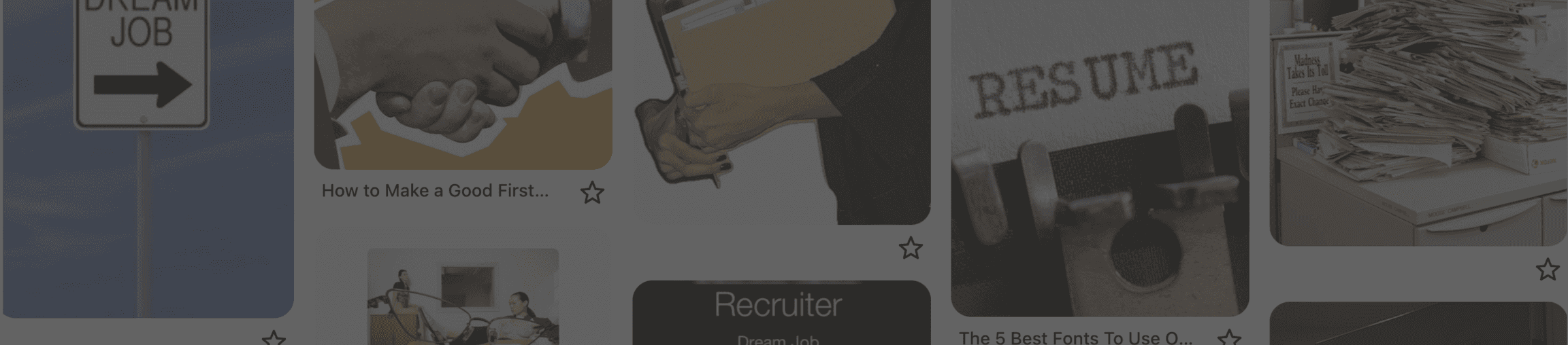
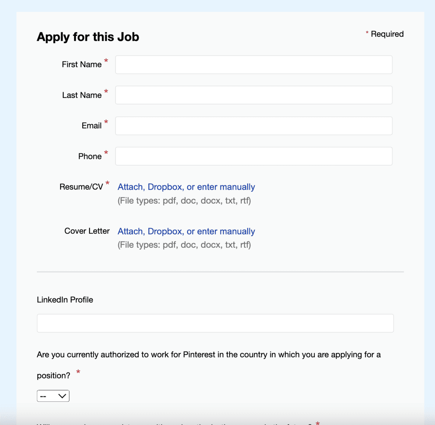
As part of the discovery phase, I audited Pinterest’s career site to assess how well the application experience aligns with the brand’s identity and user expectations.
Despite Pinterest being a highly visual, creative platform, I found that the job application interface fell short in multiple areas.
Key Issues Identified:
Standard static form layout
No interactivity or engaging UI
Lacks the visual, creative vibe Pinterest is known for
No scroll-up button or page navigation cues
Visually bland and overly text-based
Design
Design
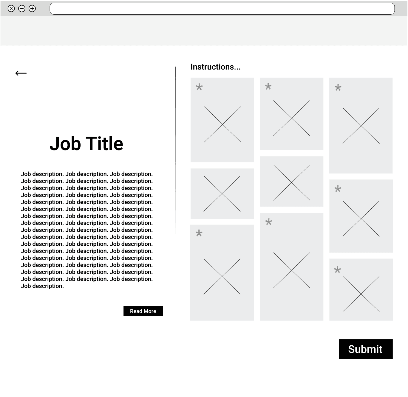
Low-Fi Wireframes
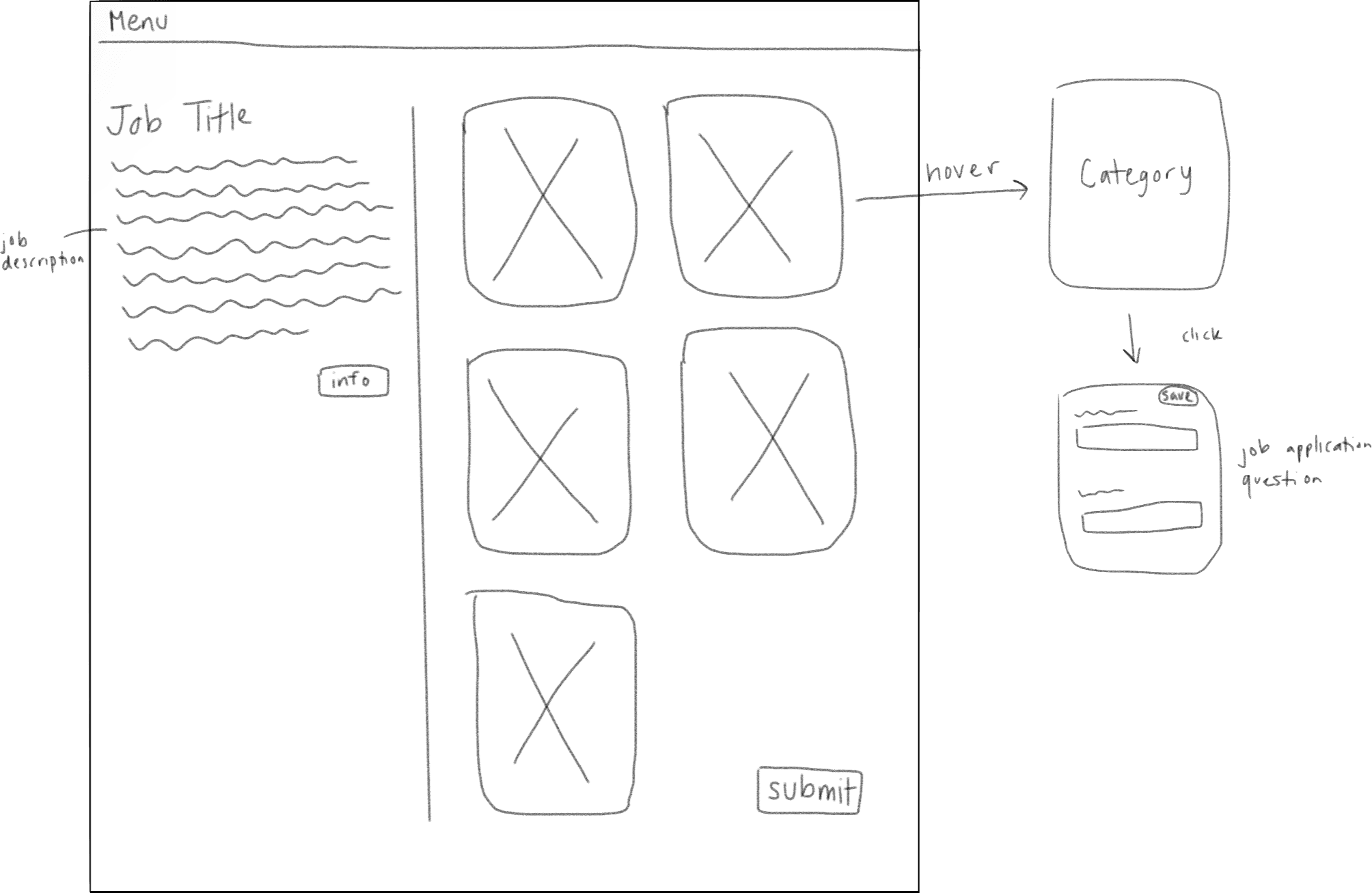
Based on "Idea 02" from the brainstorming session, I created a low-fidelity wireframe in Figma, including the hover and clicked states of the boxes (shown on right).
Usability Testing
Usability Testing
User Feedback
To measure the impact of my new design and test usability for potential future iterations, I conducted an user survey with 10 participants testing the current design's performance vs. the redesign.
80%
of users reported redesign as more visually appealing
"I really like the second design where everything is icon-based and next to each other — the other design feels like you’re endlessly scrolling."
70%
of users felt redesign was more aligned with Pinterest's brand
"I think the second design is more reflective of the Pinterest brand. The original design provided too many details before getting to the application."
80%
of users reported redesign made them feel more motivated to complete job application
"Just wow — brilliant idea."
50%
of users expressed issues with ease of usability.
"Sometimes, some people prefer to take a look at all the questions before starting to answer, so the cards would have to be opened and closed several times."
What Users Liked
visual creative design
job application and description side-by-side
more interactive/fun
What Users Disliked
incompatibility with resume autofill
interactivity not intuitive
too many clicks to complete
no indications of completed vs uncompleted questions
Conclusion
Conclusion
Next Steps
If I were to continue with this project and do an iteration, here are the improvements I would make based on the user feedback:
01
include guiding directions above container boxes indicating interaction
02
add an expand all button, giving users the option to view questions without clicking each box
03
provide a visual differentiator for container boxes with completed questions
04
create button for resume autofill, where resume information is dispersed into each boxes' clicked state and users can then save
What I Learned
This project was completed as a one-day design sprint, challenging me to make fast yet thoughtful UX decisions while balancing usability, user needs, and brand identity. My key takeaways include:
Balancing aesthetics with usability is key.
⚙️🎨
Fast timelines can still produce meaningful insights.
⏱️
Small interaction details have significant impact.
🔄
Research doesn't need to be complex to be actionable.
📊
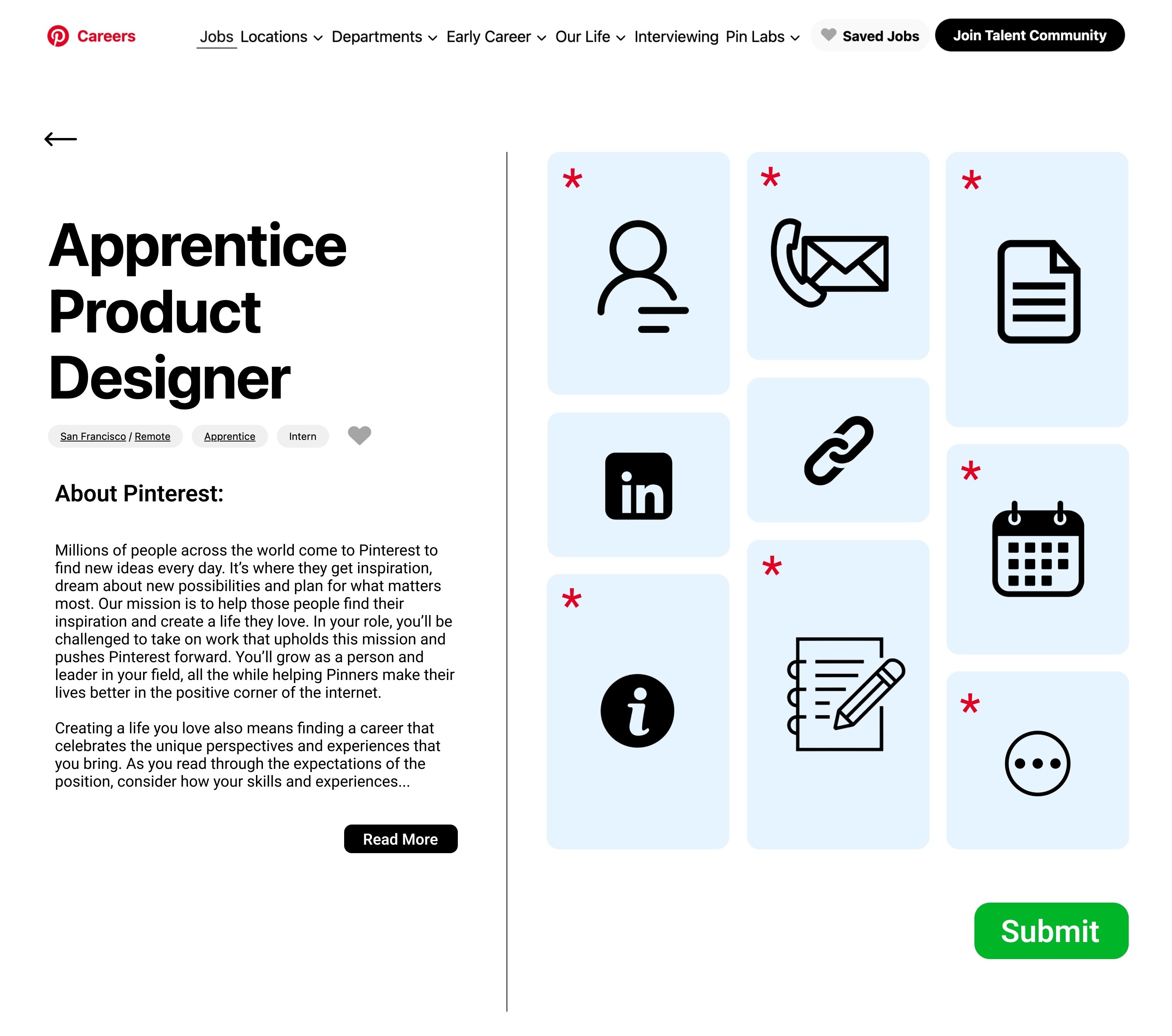
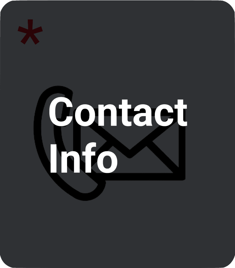
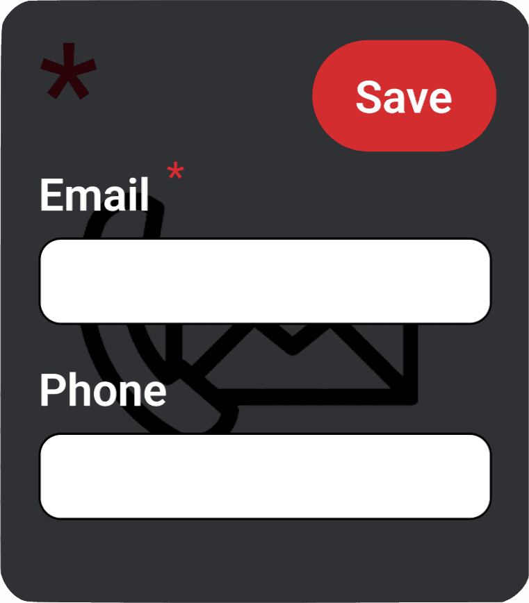
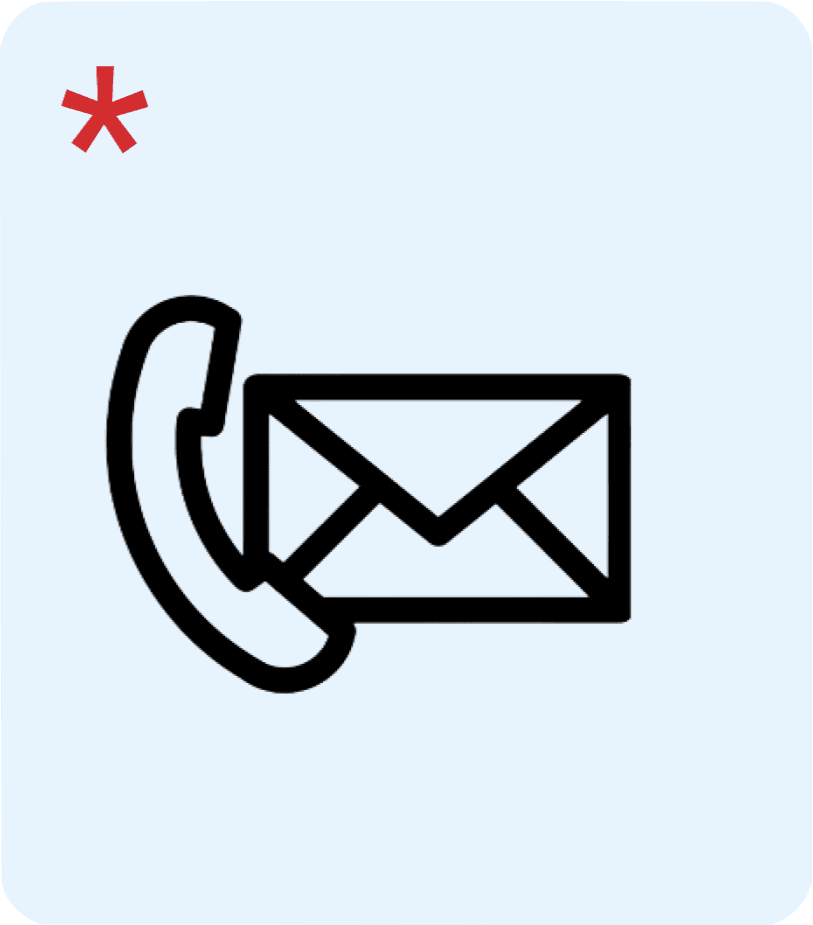
Final Design
Based on "Idea 02" from the brainstorming session, I created a low-fidelity wireframe in Figma, including the hover and clicked states of the boxes (shown on right).
Primary
Hover
Click
Ideation
Ideation
Solution Sketches
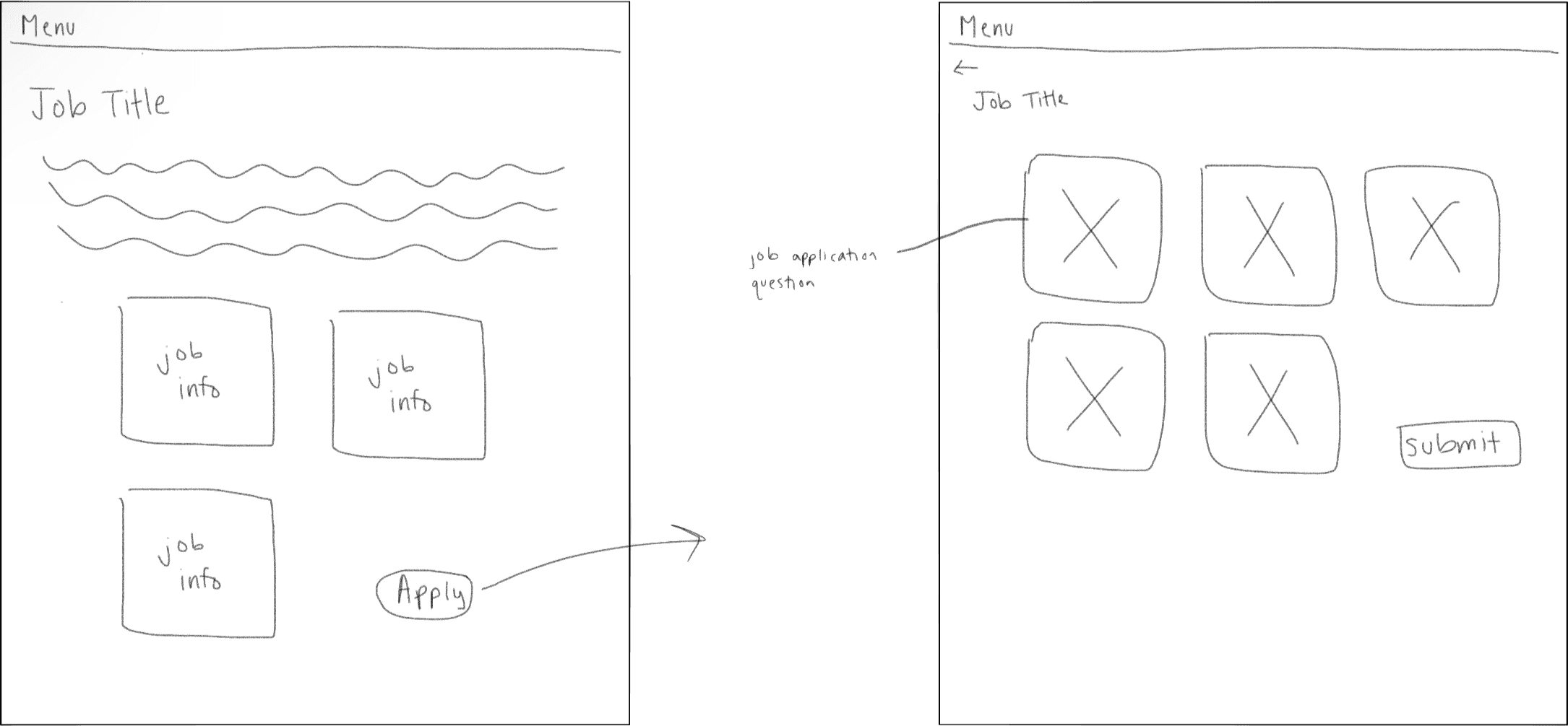
With the current design and job application perimeters in mind, as well as my observations from Pinterest, I brainstormed and sketched some potential design ideas.
Idea 01
The job description and application form appear on the same page, but only the form uses a tile layout.
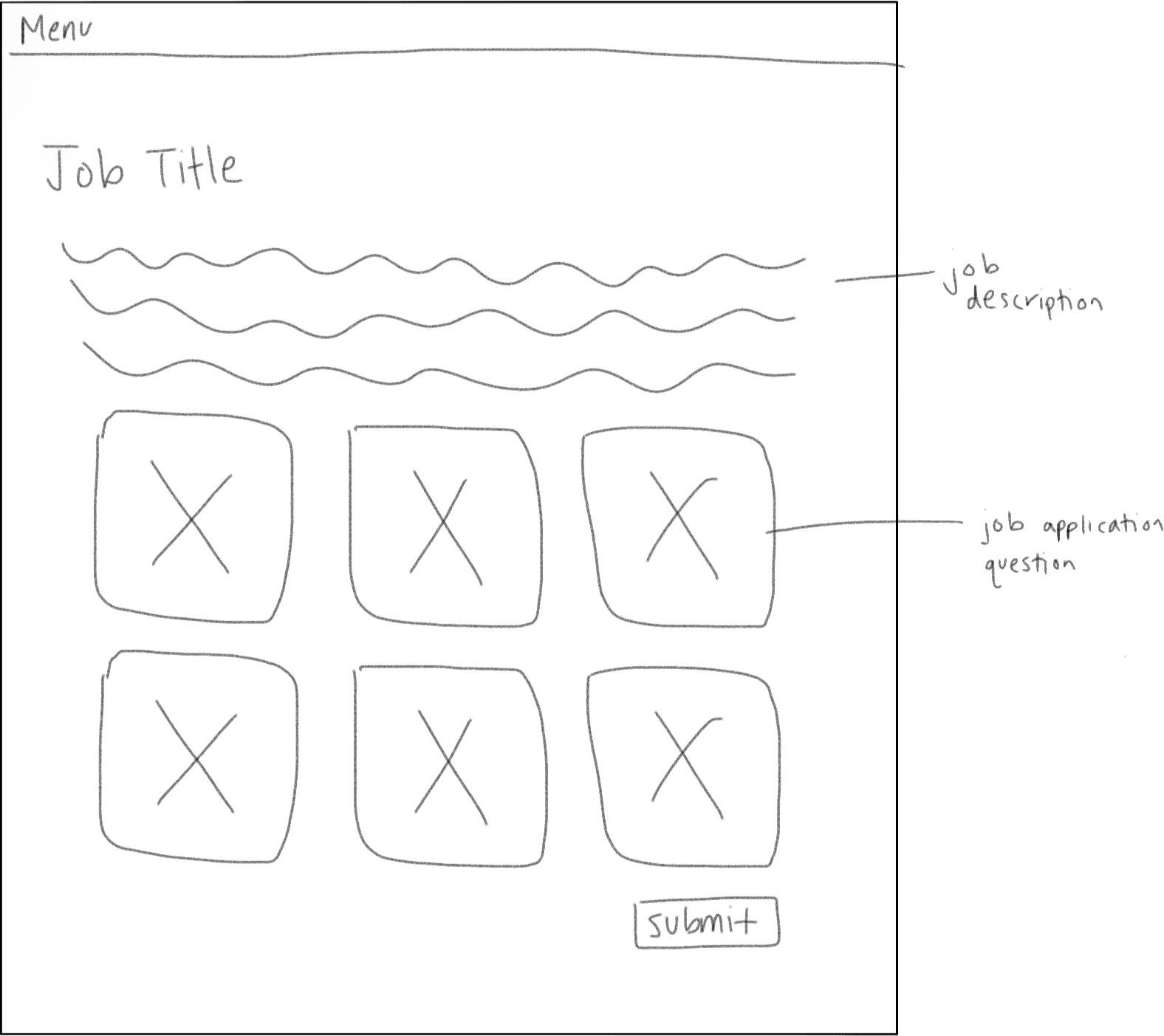
Idea 02
The job description is on the left with expandable “Info” sections; the form on the right mimics Pinterest’s board-style tiles with hover and save interactions.
Idea 03
On the job page, users see tile job description blocks (i.e. role requirements). Clicking “Apply” opens a form where each question is an individual tile.
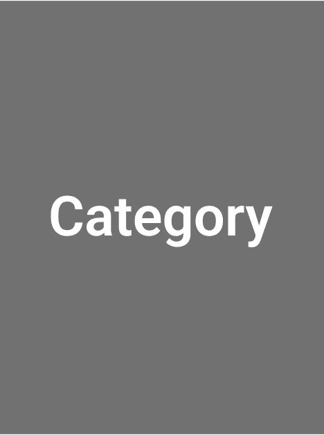
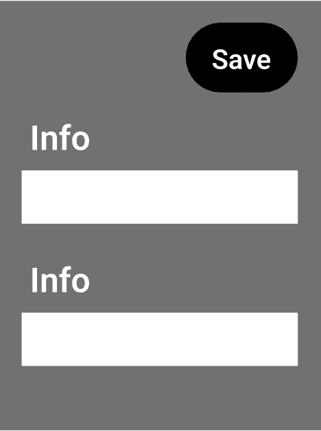
Gather Inspiration
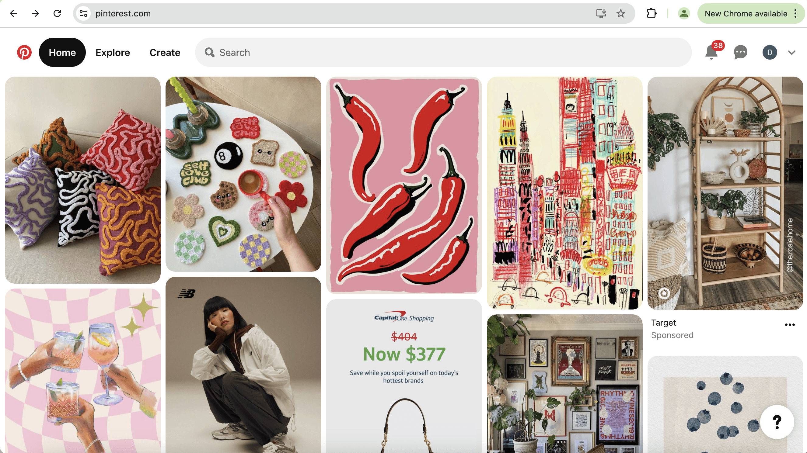
My goal of the project was to integrate the style and interactivity of the Pinterest app into their job applications. Thus, my next step was to gather inspiration from the Pinterest app itself, with a focus on the tile feature.
Key Pinterest Design Features:
Simple/clean design
Tiles evenly separated
Hover over tile = display buttons and darken
Save darkens when clicked
When tile is clicked, pop-up window opens
Assess
Current
As part of the discovery phase, I audited Pinterest’s career site to assess how well the application experience aligns with the brand’s identity and user expectations.
Despite Pinterest being a highly visual, creative platform, I found that the job application interface fell short in multiple areas.
Key Issues Identified:
Standard static form layout
No interactivity or engaging UI
Lacks the visual, creative vibe Pinterest is known for
No scroll-up button or page navigation cues
Visually bland and overly text-based
Discover
Assess Current
As part of the discovery phase, I audited Pinterest’s career site to assess how well the application experience aligns with the brand’s identity and user expectations.
Despite Pinterest being a highly visual, creative platform, I found that the job application interface fell short in multiple areas.
Key Issues Identified:
Standard static form layout
No interactivity or engaging UI
Lacks the visual, creative vibe Pinterest is known for
No scroll-up button or page navigation cues
Visually bland and overly text-based
Ideation
Ideation
Solution Sketches
With the current design and job application perimeters in mind, as well as my observations from Pinterest, I brainstormed and sketched some potential design ideas.
Idea 01
The job description and application form appear on the same page, but only the form uses a tile layout.
Idea 02
The job description is on the left with expandable “Info” sections; the form on the right mimics Pinterest’s board-style tiles with hover and save interactions.
Idea 03
On the job page, users see tile job description blocks (i.e. role requirements). Clicking “Apply” opens a form where each question is an individual tile.
Design
Design
Low-Fi Wireframes
Based on "Idea 02" from the brainstorming session, I created a low-fidelity wireframe in Figma, including the hover and clicked states of the boxes (shown on right).
Usability Testing
Usability Testing
User Feedback
To measure the impact of my new design and test usability for potential future iterations, I conducted an user survey with 10 participants testing the current design's performance vs. the redesign.
80%
of users reported redesign as more visually appealing
"I really like the second design where everything is icon-based and next to each other — the other design feels like you’re endlessly scrolling."
70%
of users felt redesign was more aligned with Pinterest's brand
"I think the second design is more reflective of the Pinterest brand. The original design provided too many details before getting to the application."
80%
of users reported redesign made them feel more motivated to complete job application
"Just wow — brilliant idea."
50%
of users expressed issues with ease of usability.
"Sometimes, some people prefer to take a look at all the questions before starting to answer, so the cards would have to be opened and closed several times."
What Users Liked
visual creative design
job application and description side-by-side
more interactive/fun
What Users Disliked
incompatibility with resume autofill
interactivity not intuitive
too many clicks to complete
no indications of completed vs uncompleted questions
Conclusion
Conclusion
Next Steps
If I were to continue with this project and do an iteration, here are the improvements I would make based on the user feedback:
01
include guiding directions above container boxes indicating interaction
02
add an expand all button, giving users the option to view questions without clicking each box
03
provide a visual differentiator for container boxes with completed questions
04
create button for resume autofill, where resume information is dispersed into each boxes' clicked state and users can then save
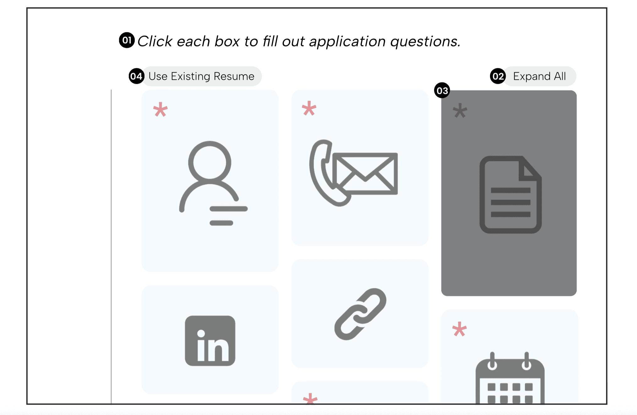
01
Expand All
02
Click each box to fill out application questions.
03
Use Existing Resume
04
What I Learned
This project was completed as a one-day design sprint, challenging me to make fast yet thoughtful UX decisions while balancing usability, user needs, and brand identity. My key takeaways include:
Balancing aesthetics with usability is key.
⚙️🎨
Fast timelines can still produce meaningful insights.
⏱️
Small interaction details have significant impact.
🔄
Research doesn't need to be complex to be actionable.
📊
Final Design
Based on "Idea 02" from the brainstorming session, I created a low-fidelity wireframe in Figma, including the hover and clicked states of the boxes (shown on right).
Primary
Hover
Click
Gather Inspiration
My goal of the project was to integrate the style and interactivity of the Pinterest app into their job applications. Thus, my next step was to gather inspiration from the Pinterest app itself, with a focus on the tile feature.
Key Pinterest Design Features:
Simple/clean design
Tiles evenly separated
Hover over tile = display buttons and darken
Save darkens when clicked
When tile is clicked, pop-up window opens
Solution Sketches
With the current design and job application perimeters in mind, as well as my observations from Pinterest, I brainstormed and sketched some potential design ideas.
Idea 01
The job description and application form appear on the same page, but only the form uses a tile layout.
Idea 02
The job description is on the left with expandable “Info” sections; the form on the right mimics Pinterest’s board-style tiles with hover and save interactions.
Idea 03
On the job page, users see tile job description blocks (i.e. role requirements). Clicking “Apply” opens a form where each question is an individual tile.
Ideation
Low-Fi Wireframes
Based on "Idea 02" from the brainstorming session, I created a low-fidelity wireframe in Figma, including the hover and clicked states of the boxes (shown on right).
Design
Final Design
Based on "Idea 02" from the brainstorming session, I created a low-fidelity wireframe in Figma, including the hover and clicked states of the boxes (shown on right).
Primary
Hover
Click
User Feedback
To measure the impact of my new design and test usability for potential future iterations, I conducted an user survey with 10 participants testing the current design's performance vs. the redesign.
80%
of users reported redesign as more visually appealing
"I really like the second design where everything is icon-based and next to each other — the other design feels like you’re endlessly scrolling."
70%
of users felt redesign was more aligned with Pinterest's brand
"I think the second design is more reflective of the Pinterest brand. The original design provided too many details before getting to the application."
80%
of users reported redesign made them feel more motivated to complete job application
"Just wow — brilliant idea."
50%
of users expressed issues with ease of usability.
"Sometimes, some people prefer to take a look at all the questions before starting to answer, so the cards would have to be opened and closed several times."
What Users Liked
visual creative design
job application and description side-by-side
more interactive/fun
What Users Disliked
incompatibility with resume autofill
interactivity not intuitive
too many clicks to complete
no indications of completed vs uncompleted questions
Usability Testing
Next Steps
If I were to continue with this project and do an iteration, here are the improvements I would make based on the user feedback:
01
include guiding directions above container boxes indicating interaction
02
add an expand all button, giving users the option to view questions without clicking each box
03
provide a visual differentiator for container boxes with completed questions
04
create button for resume autofill, where resume information is dispersed into each boxes' clicked state and users can then save
01
Expand All
Click each box to fill out application questions.
02
03
Use Existing Resume
04
Conclusion
What I
Learned
This project was completed as a one-day design sprint, challenging me to make fast yet thoughtful UX decisions while balancing usability, user needs, and brand identity. My key takeaways include:
Balancing aesthetics with usability is key.
⚙️🎨
Fast timelines can still produce meaningful insights.
⏱️
Small interaction details have significant impact.
🔄
Research doesn't need to be complex to be actionable.
📊
Danielle Sarkisian
Danielle Sarkisian
Danielle Sarkisian