trubel&co
trubel&co
trubel&co
Redesigning climate education nonprofit's website, resulting in a reported 20% increase in ease of navigation and an 8% increase in likelihood of CTA completion.

Overview
Overview
In this project, we worked with trubel&co, an edtech nonprofit focused on empowering youth with data skills to promote environmental justice.
The Problem: Their website was not accessible or easy to navigate, making it difficult for students to find information and for donors to be encouraged to contribute.
In our final product, we...
1) reduced redundant information by tightening and streamlining the information architecture
2) created a more accessible design system and
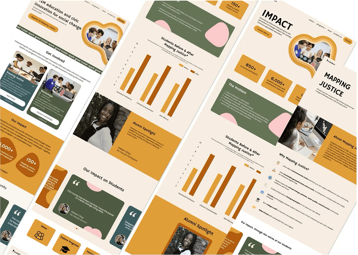
3) fully redesigned the website’s three main pages: the Home, Impact, and Mapping Justice pages.
In this project, we worked with trubel&co, an edtech nonprofit focused on empowering youth with data skills to promote environmental justice.
The Problem: Their website was not accessible or easy to navigate, making it difficult for students to find information and for donors to be encouraged to contribute.
In our final product, we...
1) reduced redundant information by tightening and streamlining the information architecture
2) created a more accessible design system and
3) fully redesigned the website’s three main pages: the Home, Impact, and Mapping Justice pages.
Duration
Duration
4 months
4 months
Context
Context
Professional Project
Professional Project
Skills
Skills
UI Design | Product Design | Rapid Prototyping
UI Design | Product Design | Rapid Prototyping
Tools
Tools


Overview
In this project, we worked with trubel&co, an edtech nonprofit focused on empowering youth with data skills to promote environmental justice.
The Problem: Their website was not accessible or easy to navigate, making it difficult for students to find information and for donors to be encouraged to contribute.
In our final product, we...
1) reduced redundant information by tightening and streamlining the information architecture
2) created a more accessible design system and
3) fully redesigned the website’s three main pages: the Home, Impact, and Mapping Justice pages.
Duration
4 months
Context
Professional Project
Skills
UI Design
Product Design Rapid Prototyping
Tools
Team
Team
Team
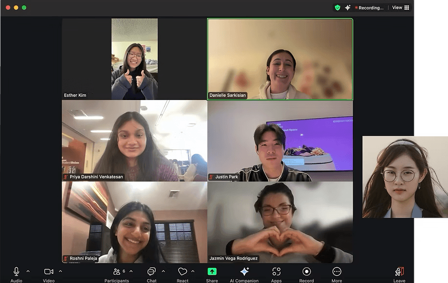
Product Design Manager
Product Design Manager
Product Design Manager
Danielle Sarkisian (Me!)
Danielle Sarkisian (Me!)
Danielle Sarkisian (Me!)
Product Manager
Product Manager
Product Manager
Esther Kim
Esther Kim
Esther Kim
Designers
Designers
Designers
Roshni Paleja, Jazmin Vega Rodriguez, Priya Venkatesan, Justin Park, Neath Heng
Roshni Paleja, Jazmin Vega Rodriguez, Priya Venkatesan, Justin Park, Neath Heng
Roshni Paleja, Jazmin Vega Rodriguez, Priya Venkatesan, Justin Park, Neath Heng
Project Scope
Project Scope
Design & Product Strategy
Design & Product Strategy
Danielle & Esther
Danielle & Esther
Information Architecture
Information Architecture
Danielle (Lead), All Team
Danielle (Lead), All Team
Impact Page
Impact Page
Justin & Priya
Justin & Priya
Home Page Design
Home Page Design
Roshni & Jazmin
Roshni & Jazmin
Accessible Design System
Accessible Design System
All Team
All Team
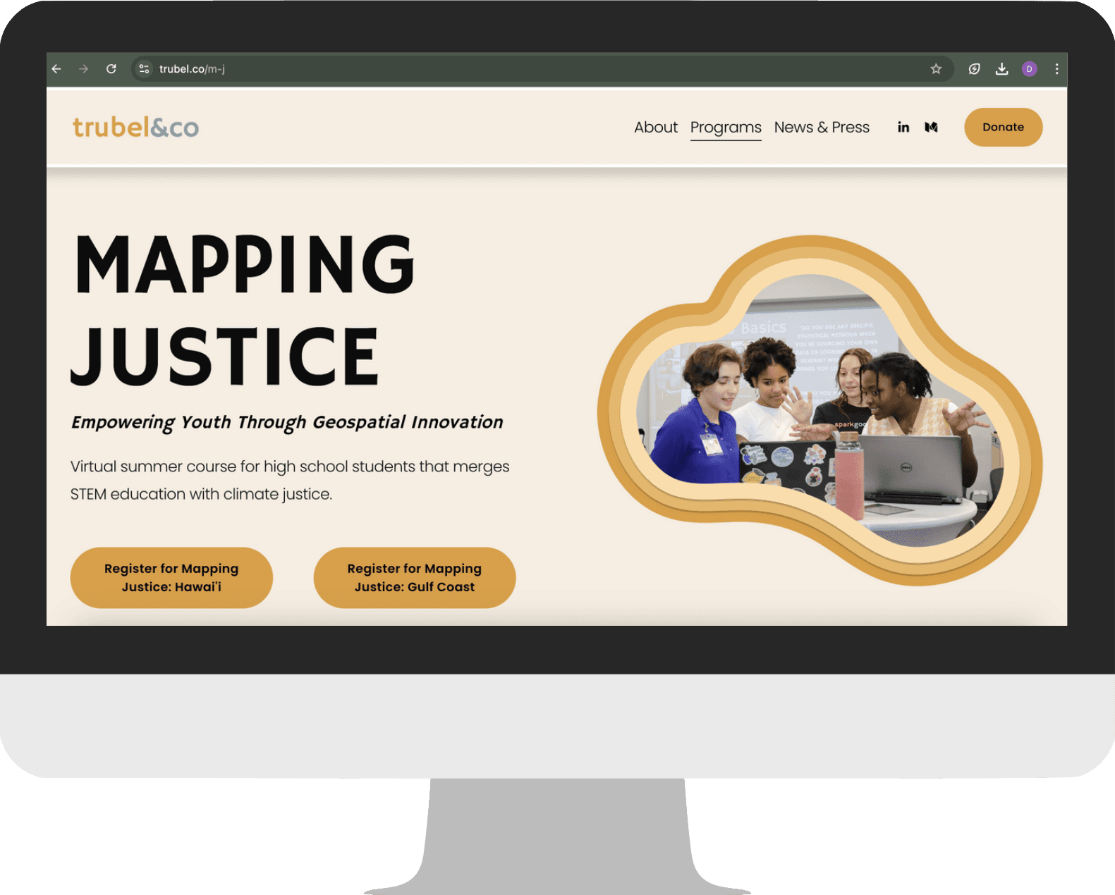
Mapping Justice Page
Mapping Justice Page
Danielle & Neath
Danielle & Neath
Discover
Discover
Discover
Our Observations
Our Observations
Our Observations
Through our team's exploration of the current website, we made the following observations:
busy visual design that doesn't meet accessibility standards
too much information and offerings are unclear
too many pages and difficulty finding info
lack of clear call to actions
embedded Mapping Justice page was difficult to use
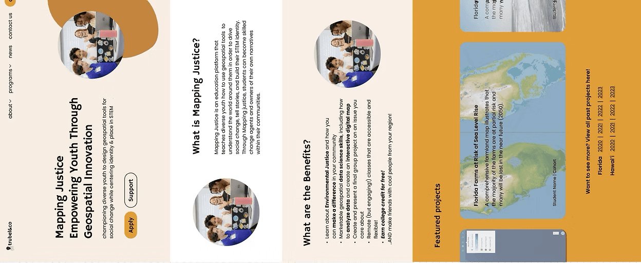
Home Page
Home Page
Impact Page
Impact Page
Mapping Justice Page
Mapping Justice Page


Initial User Survey
Using Qualtrics, we conducted an initial survey to evaluate users' experiences with trubel&co's original website. This helped us identify key pain points by understanding target user groups' thought processes while navigating the site.
For participants unfamiliar with trubel&co, we provided the following user role prompts to simulate real interactions:
Goal: locate student application info, details of the Mapping Justice curriculum, and alumni impact.
Prospective Students
Goal: lfind workshop info and discover how to request one.
Workshop Customers
Goal: discover organization's mission, impact, and how to donate or support.
Workshop Customers
Potential Donors
Based on our results, we found the following:
🔍
Navigation Issues
Users across all groups struggled to find information on workshops, applications, and donations, indicating potential problems with website navigation, information architecture, or unclear calls to action. The "apply" button/link was a particular pain point.
🤯
Information Overload
Reported too much text, difficulty skimming, and issues with color pairings affecting readability.
Unclear Pricing & Donation Info
Unclear pricing information for workshops and a desire for more transparency regarding how donations are used.
Confusion About Programs
Confusion about the Mapping Justice program, its locations, and how to find example projects. While some found the information, others struggled.
👍
Liked Mission & Org Voice
Respondents appreciated the organization's mission, the website"voice", and student quotes.
💤
Survey Fatigue
One respondent explicitly mentioned survey fatigue, highlighting the importance of keeping surveys concise and focused.
Initial User Survey
Using Qualtrics, we conducted an initial survey to evaluate users' experiences with trubel&co's original website. This helped us identify key pain points by understanding target user groups' thought processes while navigating the site.
For participants unfamiliar with trubel&co, we provided the following user role prompts to simulate real interactions:
Goal: locate student application info, details of the Mapping Justice curriculum, and alumni impact.
Prospective Students
Goal: lfind workshop info and discover how to request one.
Workshop Customers
Goal: discover organization's mission, impact, and how to donate or support.
Potential Donors
Based on our results, we found the following:
🔍
Navigation Issues
Users across all groups struggled to find information on workshops, applications, and donations, indicating potential problems with website navigation, information architecture, or unclear calls to action. The "apply" button/link was a particular pain point.
🤯
Information Overload
Reported too much text, difficulty skimming, and issues with color pairings affecting readability.
Unclear Pricing & Donation Info
Unclear pricing information for workshops and a desire for more transparency regarding how donations are used.
Confusion About Programs
Confusion about the Mapping Justice program, its locations, and how to find example projects. While some found the information, others struggled.
👍
Liked Mission & Org Voice
Respondents appreciated the organization's mission, the website"voice", and student quotes.
💤
Survey Fatigue
One respondent explicitly mentioned survey fatigue, highlighting the importance of keeping surveys concise and focused.
Define
Define
Define
Information Architecture
Information Architecture
Information Architecture
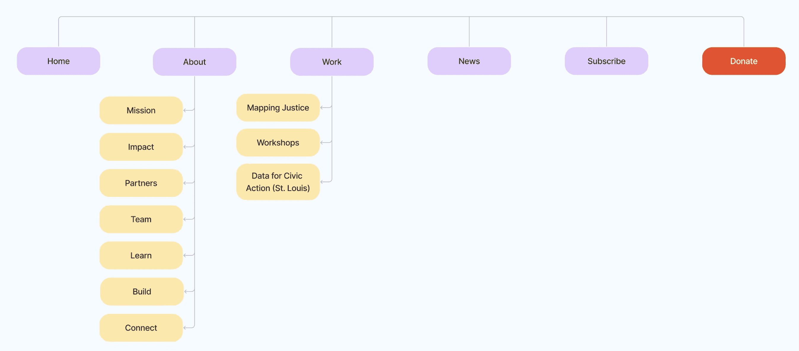
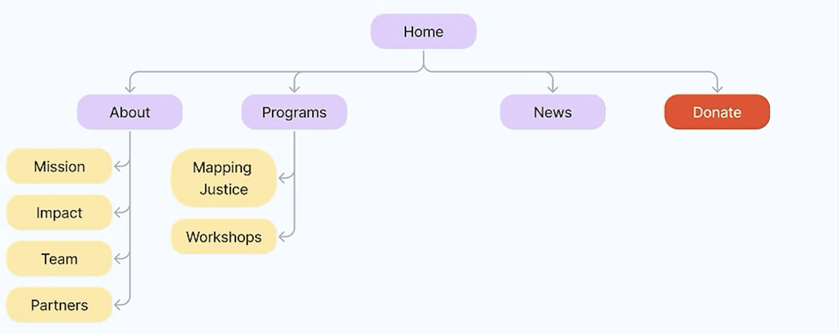
Given our observations and research insights, we changed the information architecture by:
1) reducing the number of navigation bar items
2) deleting unnecessary pages
3) making the information on each page concise.
Given our observations and research insights, we changed the information architecture by:
1) reducing the number of navigation bar items
2) deleting unnecessary pages
3) making the information on each page concise.
Given our observations and research insights, we changed the information architecture by:
1) reducing the number of navigation bar items
2) deleting unnecessary pages
3) making the information on each page concise.
Before
Before
After
After
Low-Fi Wireframes
Low-Fi Wireframes
For low-fis, we focused on defining the core structure, user flow, and information hierarchy for each page.
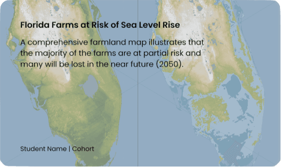
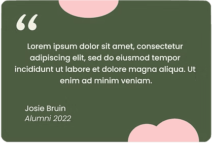
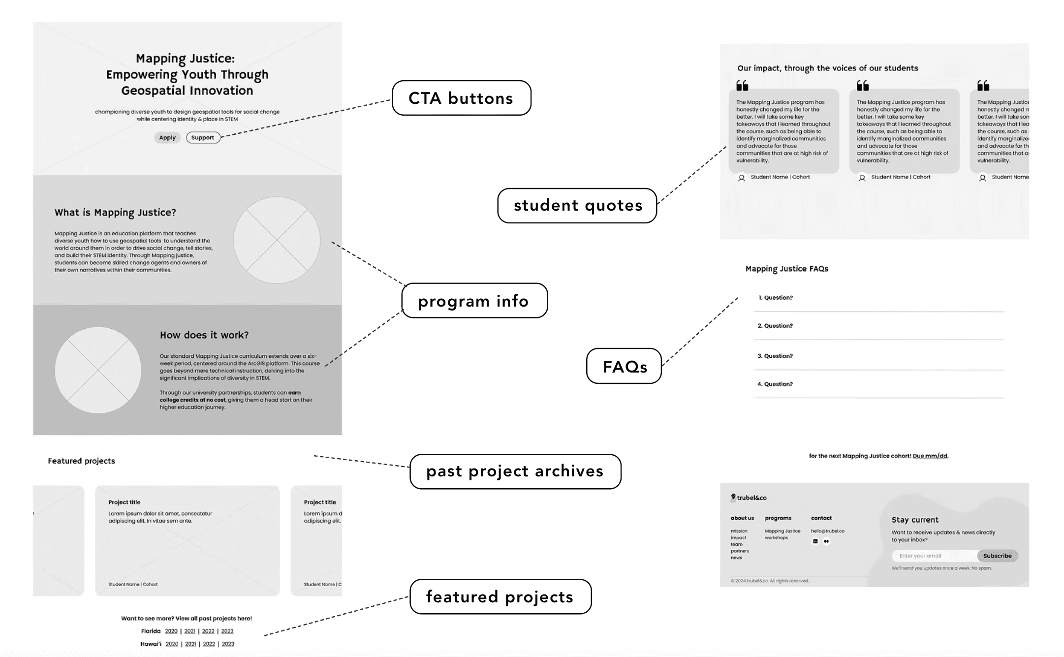
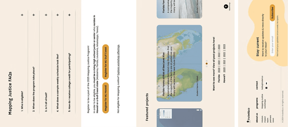
Compared to the original Mapping Justice page design, we added student testimonials, organized past projects, an FAQ section, and clear CTAs to apply.
For low-fis, we focused on defining the core structure, user flow, and information hierarchy for each page.
Compared to the original Mapping Justice page design, we added student testimonials, organized past projects, an FAQ section, and clear CTAs to apply.
Design
Design
Design
Accessible System
Accessible System
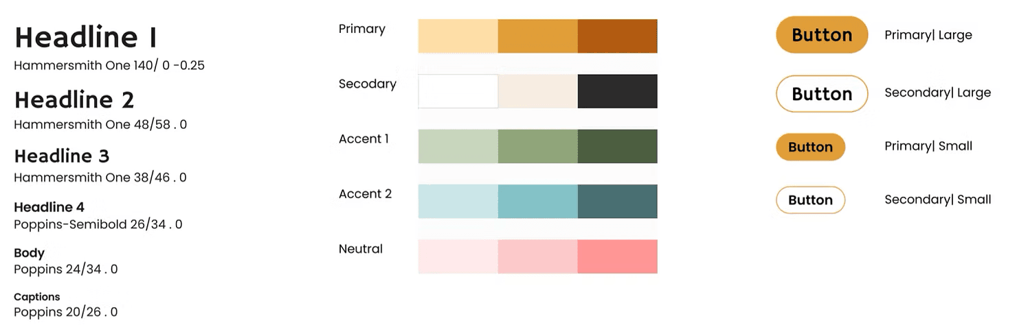
Our team developed a design system to improve accessibility and consistency by standardizing typography, colors, and UI components, ensuring a cohesive and user-friendly experience. We added a secondary complementary font and focused on a primary color with various accents.
Our team developed a design system to improve accessibility and consistency by standardizing typography, colors, and UI components, ensuring a cohesive and user-friendly experience. We added a secondary complementary font and focused on a primary color with various accents.
Initial
Iteration
Initial Iteration
For Mapping justice, key design elements, such as typography, imagery, and call-to-action buttons were selected to enhance clarity, user engagement, and stakeholder expectaions.
For Mapping justice, key design elements, such as typography, imagery, and call-to-action buttons were selected to enhance clarity, user engagement, and stakeholder expectaions.
Key Focus Areas:
Key Focus Areas:
🗂️
🗂️
Layout
Layout
Developed the foundational layout for the Mapping Justice Page
Developed the foundational layout for the Mapping Justice Page
🧭
🧭
Navigation
Navigation
Clear storytelling and understanding of how users move through the content
Clear storytelling and understanding of how users move through the content
🗣️
🗣️
Call-to-Actions (CTAs)
Call-to-Actions (CTAs)
Placed initial CTAs to drive desired user action
Placed initial CTAs to drive desired user action
📝
📝
Microcopy
Microcopy
Initial text choices to introduce program and explain its purpose
Initial text choices to introduce program and explain its purpose
🎨
🎨
Visual Design
Visual Design
Integrate new visual design system and elements like color and typography
Integrate new visual design system and elements like color and typography
Stakeholder Feedback (for next iteration):
Stakeholder Feedback (for next iteration):
disliked circle photos
wanted to change order of blocks by moving up quotes and moving down featured projects
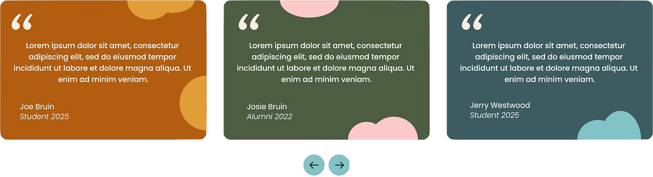
design team decided to standardize quote design system across pages (as seen in design system)
liked different colors for each block
disliked circle photos
wanted to change order of blocks by moving up quotes and moving down featured projects
design team decided to standardize quote design system across pages (as seen in design system)
liked different colors for each block
Usability Testing
Usability Testing
We conducted a quick usability test and found:
We conducted a quick usability test and found:
📝
📝
Microcopy & Info Organization Ineffective
Microcopy & Info Organization Ineffective
Participants emphasized the need for simpler language and clearer content presentation to improve user engagement.
Participants emphasized the need for simpler language and clearer content presentation to improve user engagement.
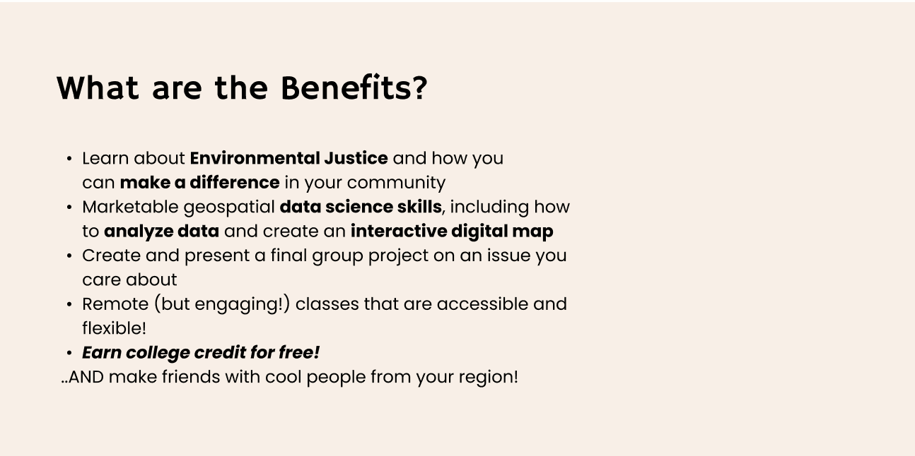
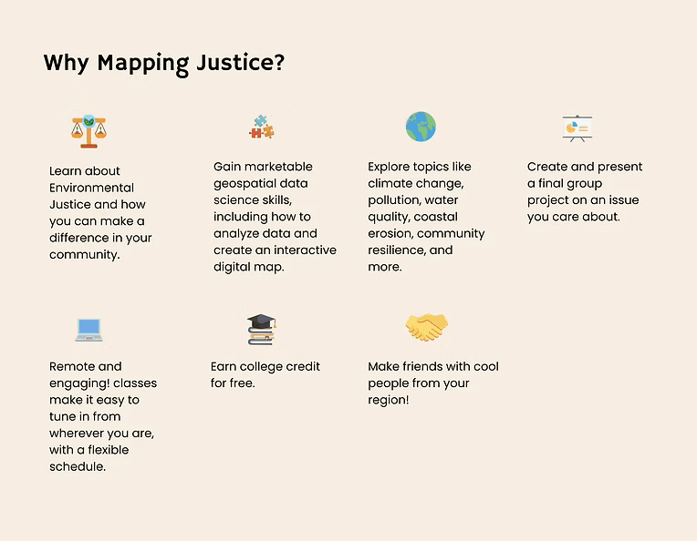
Based on the results, I suggested changing the design of the "Why Mapping Justice" block to something more visibly digestible with broken up text and icons.
Of the two new options, we chose the list view, as it allows users to scan as they scroll through the page.
Based on the results, I suggested changing the design of the "Why Mapping Justice" block to something more visibly digestible with broken up text and icons.
Of the two new options, we chose the list view, as it allows users to scan as they scroll through the page.

Client Preference
Client Preference
Final Design
Final Design
For Mapping justice, key design elements, such as typography, imagery, and call-to-action buttons were selected to enhance clarity, user engagement, and stakeholder expectaions.
For Mapping justice, key design elements, such as typography, imagery, and call-to-action buttons were selected to enhance clarity, user engagement, and stakeholder expectaions.
Key Focus Areas:
Key Focus Areas:
🤔
🤔
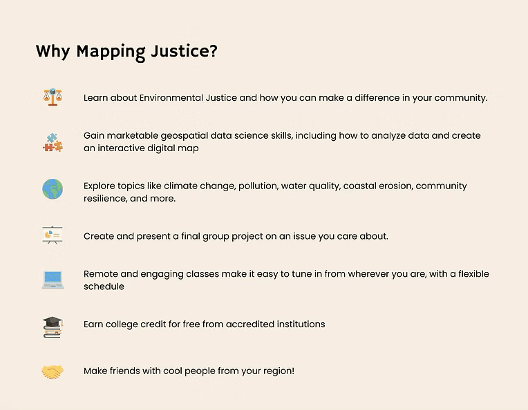
Why Mapping Justice Block
Why Mapping Justice Block
integrated list and icon view of this section
integrated list and icon view of this section
✅
✅
Improved CTAs
Improved CTAs
separate CTAs for each program location
separate CTAs for each program location
➗
➗
Added Block Division
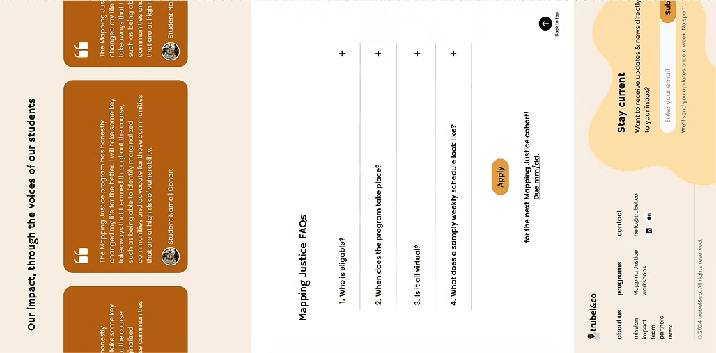
Added Block Division
used color background to create additional division between FAQs and application CTAs
used color background to create additional division between FAQs and application CTAs
📝
📝
Finalized Copy
Finalized Copy
included finalized copy for quotes, FAQs, and featured projects as provided the client
included finalized copy for quotes, FAQs, and featured projects as provided the client
Stakeholder Feedback (for next iteration):
Stakeholder Feedback (for next iteration):
Ready for implementation!
Ready for implementation!
Deliver
Deliver
Deliver
Implemenation
Implemenation
Once our designs were completed, we began implementing the page redesigns and new design system into Squarespace. Given the limitations of Squarespace, our actual implemented designs vary slightly from the final high-fidelity wireframes.
Once our designs were completed, we began implementing the page redesigns and new design system into Squarespace. Given the limitations of Squarespace, our actual implemented designs vary slightly from the final high-fidelity wireframes.
Other Pages
Other Pages
Once our designs were completed, we began implementing the page redesigns and new design system into Squarespace. Given the limitations of Squarespace, our actual implemented designs vary slightly from the final high-fidelity wireframes.
Once our designs were completed, we began implementing the page redesigns and new design system into Squarespace. Given the limitations of Squarespace, our actual implemented designs vary slightly from the final high-fidelity wireframes.
Post-Design User Results
After completing the design implementation, we conducted a post-redesign survey and compared it to our initial survey results. We found the following:
🔍
20% increase
in the ratings for "ease of finding key information"
8% increase
in overall likelihood for users to complete key actions (apply, donate)
✅
2.25 mins faster
average to find key information post-redesign
⏱️
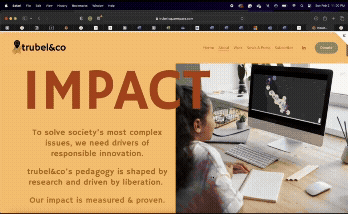
Impact
Impact
Impact
Post-Design User Results
After completing the design implementation, we conducted a post-redesign survey and compared it to our initial survey results. We found the following:
🔍
20% increase
in the ratings for "ease of finding key information"
8% increase
in overall likelihood for users to complete key actions (apply, donate)
✅
2.25 mins faster
average to find key information post-redesign
⏱️
Client Testimonial
Client Testimonial
It has been really enjoyable to work alongside such a willing team — everyone we've worked with has a great attitude and has been really easy to work with. They've been receptive to feedback, have brought their insights and ideas to the table, and have drastically improved our website's usability and appearance."
It has been really enjoyable to work alongside such a willing team — everyone we've worked with has a great attitude and has been really easy to work with. They've been receptive to feedback, have brought their insights and ideas to the table, and have drastically improved our website's usability and appearance."
— Annie Grant, Associate Director @ trubel&co
— Annie Grant, Associate Director @ trubel&co
"
"
Conclusion
Conclusion
Conclusion
What I
Learned
What I Learned
This project was an incredible opportunity to lead the design process with a product manager, strengthening my collaboration and decision-making.
I learned to balance client expectations with user needs by working closely with a key stakeholder, ensuring our designs were both strategic and user-centered. Seeing the work go live was especially rewarding, and contributing to a tech-for-good mission made the experience even more fulfilling.
Strengthened my leadership skills in the design process
Strengthened my leadership skills in the design process
👩💼🌟
👩💼🌟
Learned to balance client and user needs in real-world project setting
Learned to balance client and user needs in real-world project setting
⚖️
⚖️
Found implementation to be exciting and rewarding part of design journey
Found implementation to be exciting and rewarding part of design journey
🚀
🚀
Reinforced my passion for using design to support social impact
Reinforced my passion for using design to support social impact
🌎❤️
🌎❤️
Danielle Sarkisian


Danielle Sarkisian